The Right Way to Combine Colors – bikablo’s Tips & Tricks

In the world of bikablo, colors play a central role. If it helps clarify information while also supporting the poster layout, objects might be an untraditional color i.e. a tree may sometimes even be orange, or a lightbulb green. At bikablo, however, no matter how colorful things may get, gray is still the “color of all colors.” Our bikablo trainers have put together seven new color palettes to show which color combinations work best for both beginners and visualization pros.

by Martin Haussman

SHARE ARTICLE

Into the light: helle Töne, die nach oben streben, mit einem leichten Blau als Kontrapunkt.

Color plays a very special role in the bikablo technique. It creates structure, highlights the most important information, and indicates links between ideas. Objects can be colored naturalistically or can take on the visualizer’s personal choice for colors – or topics can be visualized using the corporate colors. We generally use colors as an organizing and strategic element, and, of course, they are always determined by the specific content.

Anyone who enjoys using color to underscore emotions should study up on the psychology of color and the use of color as a symbol. It’s best to keep a color wheel close at hand so that you can consult it when you’re combining colors.

The Venezia ice cream parlor: soothing pastel colors, inspired by a 1950’s design.
Mr.Charming: this combination of strong, warm colors creates a relaxed atmosphere that can be advantageous to efforts at persuasion.

All Colors Are Not Created Equal – Beware of Cultural Differences!

There are no universal rules about how people perceive different colors. Still, colors are usually categorized according to their “temperature”: orange is considered a “warm” color, while blue is considered “cold.” Different color combinations, however, can invoke an enormous range of various associations within the individuals viewing them.

In settings that bring people together from diverse cultures, it is especially important to be aware of the colors you choose. Asians often place different meanings on colors than do Europeans. In Korea, for instance, when a name is written in red, this signifies that the person is deceased. In ancient China, however, red was the color of happiness and stood for wealth and protection against evil spirits. It is therefore important that visualizers who will be working in an international setting first take time to learn how different colors are typically interpreted in other countries.

Fango deluxe: clean earth tones work well anywhere, not just in settings related to nature conservation.

 ZDF: classic use of the flipchart for figures, data, and facts – ensuring that all of the factual information is correct.

Interpretations of Color – the Classics

When it comes to understanding how people interpret colors, even century-old traditions play a role. But, even here, this can still be ambiguous: in the Western culture, the color red can stand for fire, but also for love – and it can also symbolize violence or signal that something is “forbidden.” Yellow stands for envy, betrayal, and cowardice, but is also associated with the sun and light. Blue is seen in the context of the sky and eternity. Green symbolizes fertility, naturalness, or peace – or simply indicates “Go!” Cooler colors (shades of blue, violet, and green) have a calming, pacifying effect – making them useful for underscoring calm, clear statements.

Objects that are drawn in cold colors seem to “recede” optically. Warmer colors (yellow or orange) are perceived by many people as pleasant, making them useful in situations where emotions need to be expressed. They have an activating and stimulating effect and, optically, seem to come to the forefront. A caveat: strong warm colors – especially red – can quickly be perceived as aggressive.

El Justo: colors as bright as the sun, from the heart of our German-Spanish trainer Justo Pulido.

Spring Time: a fresh, crisp color combination that encourages new ideas to blossom.

Grey – bikablo’s “Color of all Colors”

The color gray is completely neutral and creates a sober, objective, clear feeling. By using a number of different shades of grey, it is possible to create a nuanced, yet still soothing, color design or to add shadows that give a feeling of depth to a drawing. Gray is “everybody’s darling,” because it harmonizes so well in combination with all of the other colors. This is also true of certain lighter earth tones that invoke a sense of balance, warmth, and tranquility.

Which Neuland Markers Are Best-Suited for Color-Combining?

For a bikablo trainer’s meeting, using Neuland markers, we put together a few possible color combinations for our participants – you can find them on this page. From the refreshing spring combinations “El Justo” and “Spring Time” to the earth tone palette with the endearing name “Fango Deluxe,” there is something to suit every need and taste. The Neuland color numbers on our sample markers will help you in making your selection.
Find the right markers for your needs at the Neuland shop!


More information on the subject of color psychology can be found in the online encyclopedia for psychology and education.

The classic book on the subject of color and meaning: “How colors work: Color Psychology – Color Symbolism – Creative Color Design” by Eva Heller.


MORE ARTICLES ON THIS TOPIC

You Might Also Be Interested In...

sharing iPad screen in MS Teams using CamLink and OBS

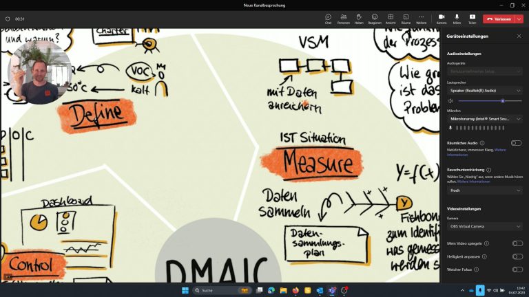
How to use your iPad instead of the webcam in MS Teams

Why do I want to connect the iPad to MS Teams (or Zoom)?
I would like to be able to show my iPad Screen as a tile in the normal Teams window. It should be subtle and not by sharing my screen to draw to much attention and to have a seamless switch between different views. I can i.e.
• document the meeting using OneNote or ProCreate
• easily zoom into pictures or drawing
• easily annotate pictures or digital whiteboards
• using the drawing feature while presenting your content

Hiromi Hara

Design Thinking and Visual Thinking – a perfect fit?

In a recent interview Hiromi Hara speaks about her experience with applying the design thinking method with the help of visualization.
Hara explains that design thinking is not primarily about problem solving, rather about unveiling complex problems and getting better insight in the root cause of issues, hence the importance of the expression of individual perception and the comprehensible yet memorable depiction of thinking processes.

Using Visuals in Coaching

How our global trainer Jill Greenbaum got into drawing and which impact visualization has got on coaching situations.